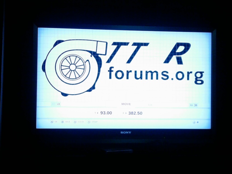
ok so i'll go over the letters first. looking at the turbo forums logo, the TURBO letters are pretty thick, everything is leaning to the right (skewed from now on) and the "g" in ".org" is a little unusual. When painting in forza you have to start with a plan. If you just jump in and start throwing stuff together, it will cause problems down the road. So i know that the in game creator has both the TURBO and forums script that I can use and only have to make very little changes.
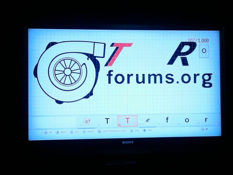
So I took the capital T and skewed it to match the logo. It looks a little to skinny. So I made a duplicate and overlapped them to make it thicker. Also when using the ingame letters the "R" is not the same. So I used the "P" and just add the bottom to it to get the R that I need. In these pictures you can see the skinny T and how I made the R. In the second picture you can see that I changed the duplicate "t" to red to show How I overlapped them to get the thicker letters.
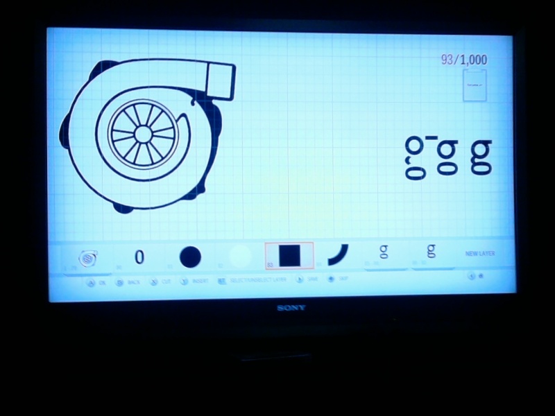
The forums. org is all ingame letters except for the "g". It is actually just a couple of simple shapes. 2 circles on top, a rectangle, 1/4 circle skewed, and the number zero tured 90 degrees. then i make 2 duplicates and overlap it 3 times to get the thickness that i need to match the other letters

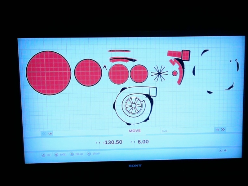
This last picture is the entire turbo broken down into the layers i made and used to get the final result. if you were to slide every piece over from right to left, you would end up with the bottom image. the "snowflake" piece that makes up the spools of the turbo are just lines that are rotated to make triangles. i changed everthing white to red so that you can see it. imagine they are different tiles, whit the left circle being the bottom and you just stack them. so some of the shapes on the right cover up some of the ones on the left to get an over all effect. going back to the top, that's why it's important to have a plan so you know how it's all gonna come together.
So I hope that answered you questions, fell free to ask if you want more details.
 Portal
 Message [Page 1 of 1]


